- Tim at Penfriend
- Posts
- “I raided Asana, ClickUp & Postman - here are 7 pricing tricks to steal today
“I raided Asana, ClickUp & Postman - here are 7 pricing tricks to steal today
Side-by-side grids, nerd tooltips, orange CTA psychology - full teardown inside.
Tim Hanson
July 25, 2025
Day 157/100
Hey—It's Tim.
Yesterday was heavy on brain-juice, so today we’re giving your eyeballs a spa day.
Grab an iced coffee, scroll some pretty pictures, and steal the tricks the pros use to make people click “Upgrade.”
Asana - “Tell me who it’s for”
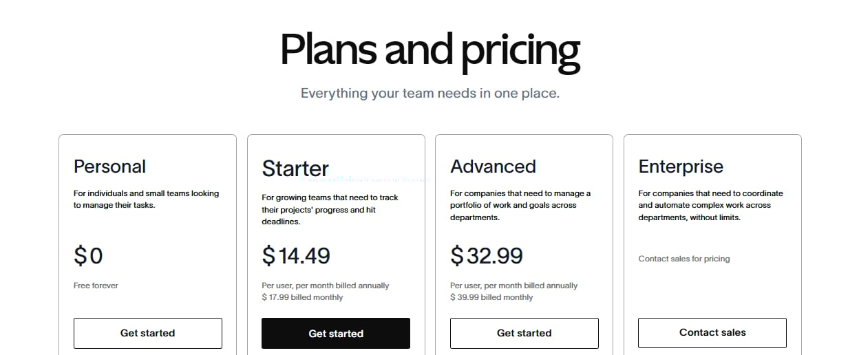
I love the get free tier here. And getting that written out. Something I’m gonna steal, I mean adapt.
Problem-first copy. Each card says who the plan serves before rattling off features.
See-through tables. Hover-friendly rows show exactly what you lose if you stay cheap.
Free tier ≠ charity. A conveyor belt: 5-10 % of freeloaders step up to paid every month.
Steal it: Rewrite your tier headings to finish the sentence: “Perfect for ___ who need ___.”
Whist I’m searching to grab these pages, I have to show you this screenshot.
The call outs from Monday and ClickUp are hilarious…
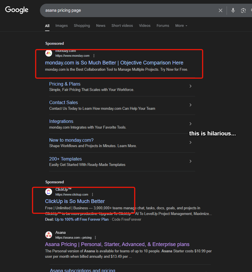
I wonder who copied who…
speaking ClickUp…
ClickUp - Clarity in colour
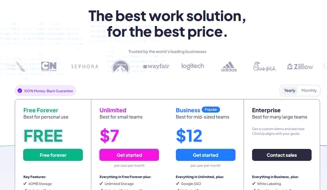
The colours here are making me happy.
Side-by-side, above the fold. Four columns, no scrolling, instant comparison.
“Everything in ___, plus…” Pavlovian: you read, you crave the next tier.
Logo parade + guarantee bar. Trust on turbo, fear on mute.
Steal it: Add a tiny guarantee ribbon beside your CTA. Conversions pop when fear drops.
Postman - Nerd nirvana done right
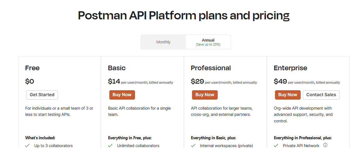
Deep-dive tooltips. Tiny “?” icons unpack jargon without turning the page into a whitepaper.
Annual toggle with savings math. “Save 25 %” is a dopamine hit finance teams can’t ignore.
Developer street-cred. Headline Enterprise with the stuff CTOs brag about.
Steal it: If your crowd is technical, speak their language - then footnote it inline.
What to grab from this
Lead with “who” not “what.” Your visitor wants to know if a plan even applies to them before they care about features.
Make the upgrade path shine. Side-by-side layouts + “Everything in X, plus…” = mental ladder climbing.
Bake in trust. Logos, guarantees, transparent tables, and a no-brainer free tier ease commitment anxiety.
Show the math. Annual toggles and seat-based pricing make ROI painfully obvious.
Educate in the moment. Tooltips or collapsible rows keep nerd-level depth without drowning the skim-reader.
How I’ll use this for the Penfriend pricing page redesign
Persona-first headings. Each tier will open with a crisp line like “For solo content hustlers” or “For in-house teams shipping 20+ articles a month.”
Live comparison grid. Sticky header cards, horizontal scroll on mobile, and a cheeky “Everything in Starter, plus…” copy loop.
Inline VIBE demos. Hover an info icon to watch a 10-sec gif of our VIBE score in action - proof beats promise.
Risk-killer bar. 30-day “Publish or Pay Nothing” guarantee pinned under the CTAs.
Annual savings slider. Toggle shows exact dollars saved so finance can high-five procurement.
Lego-block trust. Row of customer badges (yes, including that Fortune 500 we’re onboarding) right under the headline.
If you see the Penfriend page looking slicker next week, now you know why.

✌️ Tim "Screenshots > Sales calls" Hanson
CMO @Penfriend.ai
Same brain, different platforms: X, Threads, LinkedIn.
P.S. A little birdie told me the highest-converting CTA colour on SaaS pricing pages right now is… not blue.
I always check Amazon and other huge shops to see what shade of orange they’re testing this month.

Penfriend.ai
Made by content marketers. Used by better ones.
What did you think of today's newsletter? |
What to do next
Share This Update: Know someone who’d benefit? Forward this newsletter to your content team.
Get your First 3 Articles FREE EVERY MONTH! We just dropped the biggest update we’ve ever done to Penfriend a few weeks ago. Tone matching with Echo, Hub and Spoke models with Clusters, and BoFu posts.
Let Us Do It For You: We have a DFY service where we build out your next 150 articles. Let us handle your 2025 content strategy for you.