- Tim at Penfriend
- Posts
- SPACE YOUR SH!T OUT.*
SPACE YOUR SH!T OUT.*
The Japanese call it “Ma.” Designers worship it. Clients pay for it. And your stuff probably needs more of it.

Day 101/100 (that feels fun doesn’t it?)
Hey—It's Tim.
I had 4 people unsubscribe yesterday. On the 100th day? Rude.
Anywho, we keep going. 101, baby.
No time to dwell on the past. Just forward.
Ok, this is a fun one.
I love designing things. To the point that it gets in the way of shipping.
I spent 4 hours the other night making this
I get in the way all the time.
So, over the years I’ve figured out a few scrappy little tricks that make your designs look weirdly professional - even if you built it in a PowerPoint deck you were also using to explain Q2 pipeline.
I’m talking fake-it-til-you-frame-it tricks.
Hacks that work even when you're holding it all together with Google Slides, free fonts, and a hope.
Let’s start with the easiest one.
The best one?
I’ve used it for years.
Didn’t even know it had a name.
The Japanese have a name for it. Ma.
ま
The space between things.
The appreciation of empty space.
The pause.
The breath.
The gap between.
Basically:
SPACE YOUR SH*T OUT.
Most bad design is not bad - it’s cramped.
Designed it in PowerPoint
Quick story.
In my agency days, I once built a six-figure pitch deck entirely in PowerPoint.
Every other agency turned up with motion graphics and custom illustrations.
Me?
I used two fonts, white space, and three rectangles.
The client told me, "Yours was the only one that didn’t give us a headache."
We won the deal.
Simplicity is a flex.
Making things simple though, actually really hard.
Alright, here are two more scrappy design hacks that still slap:
Tint your images with your brand color
This one’s sneaky.
I do this on pretty much every picture and background on Penfriend.
Let me explain.
You're cobbling together screenshots, stock photos, random product images. It’s a visual mess.
The fast fix?
Add a semi-transparent brand color overlay on top.
Suddenly:
It looks unified.
It looks intentional.
It looks…designed.
No need for a designer. Just slap on a brand-colored rectangle at 15% opacity and move on with your life.
We have two colours. A light blue and an orange.
The orange is for big “NOTICE ME AND CLICK ME” things.
The blue is for everything else.

I cannot wait for the designers in the audience to rip this apart.
Actually, please do. Seriously. Reply to this email and tell me I’m wrong.
So, the closer I get to a CTA, the more orange things get tinted.
Start at 15% blue, then 10%, then 5%.
Then 5% orange, then 10% orange.
All the blog pages have a gradient from blue down.
The home page is orange.
Line height = instant maturity
Whenever a page looks “off” and I don’t know why?
It's the line height.
Increase it.
Just a little.
I increase it to the next multiple of 8.
Boom — your design graduated college.
14px text with tight line spacing looks like a school project.
14px text with airy line spacing looks like a SaaS company just raised $8M.
It's dumb. It's real. It works.
Scrappy doesn't mean ugly.
You can build beautiful things with duct tape and paint (the software).
See you tomorrow

✌️ Tim "I once redesigned a landing page on a napkin" Hanson
CMO @Penfriend.ai
Same brain, different platforms: X, Threads, LinkedIn.
P.S.
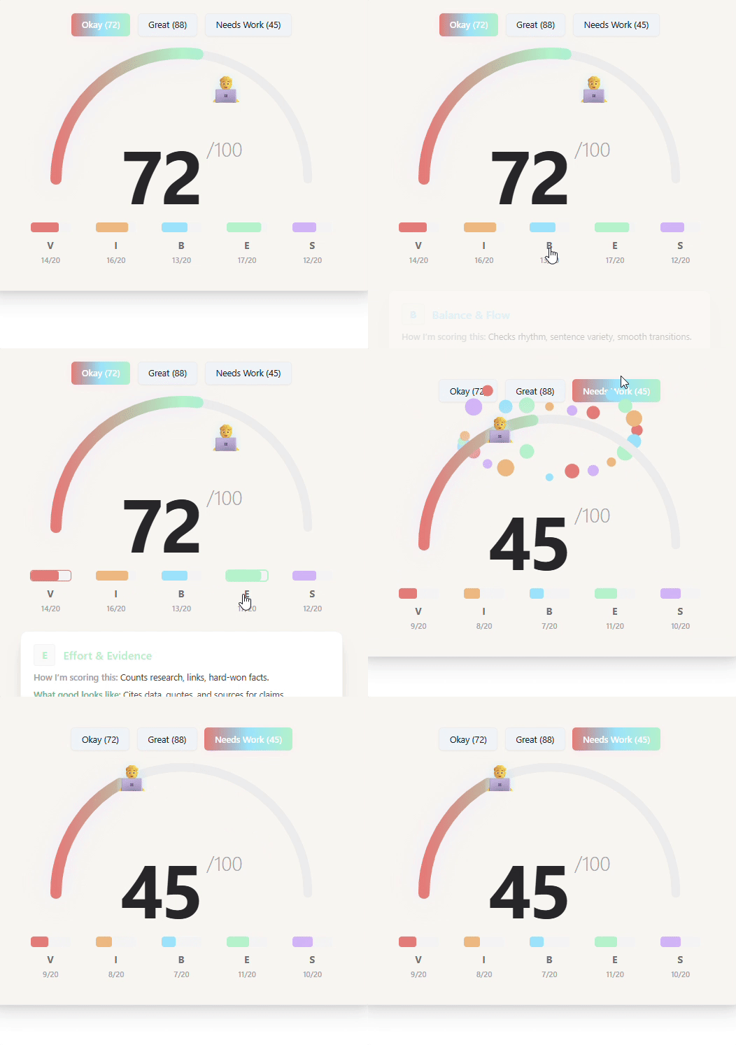
There’s a new thing in this email.
It’s unpolished. Unreleased. Possibly unhinged.
If you want the backstory - ask. I’ll show you the rest.

Penfriend.ai
Made by content marketers. Used by better ones.
What did you think of today's newsletter? |
What to do next
Share This Update: Know someone who’d benefit? Forward this newsletter to your content team.
Get your First 3 Articles FREE EVERY MONTH! We just dropped the biggest update we’ve ever done to Penfriend a few weeks ago. Tone matching with Echo, Hub and Spoke models with Clusters, and BoFu posts.
Let Us Do It For You: We have a DFY service where we build out your next 150 articles. Let us handle your 2025 content strategy for you.
